ShopDreamUp AI ArtDreamUp
Deviation Actions


Suggested Deviants


Suggested Collections


![[MindBound] : Chapter1](https://images-wixmp-ed30a86b8c4ca887773594c2.wixmp.com/f/7d786c92-67ef-4671-aa07-b0125aa1c6f1/d7ejvz8-fe506c6f-4690-4a7c-aa2f-a802752caf9f.jpg/v1/crop/w_184,h_184,x_0,y_2089,scl_0.30666666666667,q_70,strp/_mindbound____chapter1_by_l3onnie_d7ejvz8-92s-2x.jpg?token=eyJ0eXAiOiJKV1QiLCJhbGciOiJIUzI1NiJ9.eyJzdWIiOiJ1cm46YXBwOjdlMGQxODg5ODIyNjQzNzNhNWYwZDQxNWVhMGQyNmUwIiwiaXNzIjoidXJuOmFwcDo3ZTBkMTg4OTgyMjY0MzczYTVmMGQ0MTVlYTBkMjZlMCIsIm9iaiI6W1t7ImhlaWdodCI6Ijw9Mjc4NDIiLCJwYXRoIjoiXC9mXC83ZDc4NmM5Mi02N2VmLTQ2NzEtYWEwNy1iMDEyNWFhMWM2ZjFcL2Q3ZWp2ejgtZmU1MDZjNmYtNDY5MC00YTdjLWFhMmYtYTgwMjc1MmNhZjlmLmpwZyIsIndpZHRoIjoiPD02MDAifV1dLCJhdWQiOlsidXJuOnNlcnZpY2U6aW1hZ2Uub3BlcmF0aW9ucyJdfQ.JQ-15GwUfFbX0OpRLyaCDsDvSIekcU15mVDcUcPZve8)
![[MindBound] : Chapter1](https://images-wixmp-ed30a86b8c4ca887773594c2.wixmp.com/f/7d786c92-67ef-4671-aa07-b0125aa1c6f1/d7ejvz8-fe506c6f-4690-4a7c-aa2f-a802752caf9f.jpg/v1/crop/w_92,h_92,x_0,y_1044,scl_0.15333333333333,q_70,strp/_mindbound____chapter1_by_l3onnie_d7ejvz8-92s.jpg?token=eyJ0eXAiOiJKV1QiLCJhbGciOiJIUzI1NiJ9.eyJzdWIiOiJ1cm46YXBwOjdlMGQxODg5ODIyNjQzNzNhNWYwZDQxNWVhMGQyNmUwIiwiaXNzIjoidXJuOmFwcDo3ZTBkMTg4OTgyMjY0MzczYTVmMGQ0MTVlYTBkMjZlMCIsIm9iaiI6W1t7ImhlaWdodCI6Ijw9Mjc4NDIiLCJwYXRoIjoiXC9mXC83ZDc4NmM5Mi02N2VmLTQ2NzEtYWEwNy1iMDEyNWFhMWM2ZjFcL2Q3ZWp2ejgtZmU1MDZjNmYtNDY5MC00YTdjLWFhMmYtYTgwMjc1MmNhZjlmLmpwZyIsIndpZHRoIjoiPD02MDAifV1dLCJhdWQiOlsidXJuOnNlcnZpY2U6aW1hZ2Uub3BlcmF0aW9ucyJdfQ.JQ-15GwUfFbX0OpRLyaCDsDvSIekcU15mVDcUcPZve8)
![[MindBound]: Prologue](https://images-wixmp-ed30a86b8c4ca887773594c2.wixmp.com/f/7d786c92-67ef-4671-aa07-b0125aa1c6f1/d70hbh5-12caa4a9-fd88-4161-944f-b35165940e4b.jpg/v1/crop/w_184,h_184,x_0,y_1011,scl_0.23,q_70,strp/_mindbound___prologue_by_l3onnie_d70hbh5-92s-2x.jpg?token=eyJ0eXAiOiJKV1QiLCJhbGciOiJIUzI1NiJ9.eyJzdWIiOiJ1cm46YXBwOjdlMGQxODg5ODIyNjQzNzNhNWYwZDQxNWVhMGQyNmUwIiwiaXNzIjoidXJuOmFwcDo3ZTBkMTg4OTgyMjY0MzczYTVmMGQ0MTVlYTBkMjZlMCIsIm9iaiI6W1t7ImhlaWdodCI6Ijw9MTM3ODYiLCJwYXRoIjoiXC9mXC83ZDc4NmM5Mi02N2VmLTQ2NzEtYWEwNy1iMDEyNWFhMWM2ZjFcL2Q3MGhiaDUtMTJjYWE0YTktZmQ4OC00MTYxLTk0NGYtYjM1MTY1OTQwZTRiLmpwZyIsIndpZHRoIjoiPD02MDAifV1dLCJhdWQiOlsidXJuOnNlcnZpY2U6aW1hZ2Uub3BlcmF0aW9ucyJdfQ.h37z-s-nuCjk7B63dQxndcvAvCV2i1Q-gv5iNNL5fTw)
![[MindBound]: Prologue](https://images-wixmp-ed30a86b8c4ca887773594c2.wixmp.com/f/7d786c92-67ef-4671-aa07-b0125aa1c6f1/d70hbh5-12caa4a9-fd88-4161-944f-b35165940e4b.jpg/v1/crop/w_92,h_92,x_0,y_505,scl_0.115,q_70,strp/_mindbound___prologue_by_l3onnie_d70hbh5-92s.jpg?token=eyJ0eXAiOiJKV1QiLCJhbGciOiJIUzI1NiJ9.eyJzdWIiOiJ1cm46YXBwOjdlMGQxODg5ODIyNjQzNzNhNWYwZDQxNWVhMGQyNmUwIiwiaXNzIjoidXJuOmFwcDo3ZTBkMTg4OTgyMjY0MzczYTVmMGQ0MTVlYTBkMjZlMCIsIm9iaiI6W1t7ImhlaWdodCI6Ijw9MTM3ODYiLCJwYXRoIjoiXC9mXC83ZDc4NmM5Mi02N2VmLTQ2NzEtYWEwNy1iMDEyNWFhMWM2ZjFcL2Q3MGhiaDUtMTJjYWE0YTktZmQ4OC00MTYxLTk0NGYtYjM1MTY1OTQwZTRiLmpwZyIsIndpZHRoIjoiPD02MDAifV1dLCJhdWQiOlsidXJuOnNlcnZpY2U6aW1hZ2Uub3BlcmF0aW9ucyJdfQ.h37z-s-nuCjk7B63dQxndcvAvCV2i1Q-gv5iNNL5fTw)


Description
I'm thinking about uploading another page tonight and maybe another tomorrow, so be prepared for the inbox spammage!
Halfway through this page I made an inking change. It'll be more apparent in future pages, but I did some texturizing with the lines and lightened things a bit. Can you guys tell the difference? If so, what do you think?
Next page: [link]
Previous page: [link]
I really don't like this page, guys. I want to redo it so bad. :/
Image size
757x979px 1.39 MB
© 2010 - 2024 flatw00ds
Comments11
Join the community to add your comment. Already a deviant? Log In
Hi! I came across your work via the Critiqueable page.
I think I like where you're going with your style, first of all. I think the square-headedness adds interest! Also, congrats on using a consistent color palette.
As a comic page, I think there are some concerns - maybe not things to go back and fix in this page, but things to consider when making pages in the future.
-LETTERING
The most important thing about comic lettering is whether the viewer can read it or not. Is it legible? I have to focus pretty intently to read a lot of what is being said/thought, so I'm going to say that it's not especially legible. I have also handlettered a digital comic page! I hated all the comic book fonts I was aware of, so I tried just writing in the bubbles. It didn't work out very well. > dafont < is a good place to start; give it a shot! After you consider legibility, think about how well the font suits the art style and mood of the comic.
-PANELS
Another thing I learned the hard way is that viewers can't read your mind. You have an idea of what happens in your head, so when you decide what you're going to draw in the panels, those images tell the story that you've got in your head. Unfortunately, the viewer is not well-equipped to make the kind of connections between the contents of the panels and the narrative that you, the creator, can make. If you aren't explicit enough with what you put in the panels, the viewer won't fully understand what is going on.
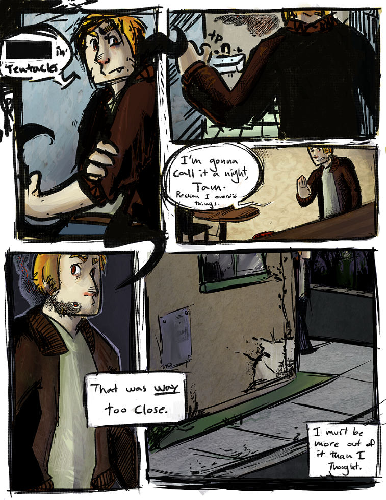
For example, I'm not sure where the main character is in the first panel. It's possible that looking at a previous page would tell me, but I need to be able to tell what his environment is from looking at just this page. I also can't tell what he is actually doing in that panel.
I can see what I am pretty sure is a sink in the second panel, so now I assume he is in a bathroom. I see what I think is a sound effect (tp?), but I can't really tell what that is in reference to, or if it's 100% a sound effect at all. I think that might be a table in panel 3, and the dialogue tells me he's in a bar. These things should be pretty clear at first glance, though. A good way to make it easier for the viewer to tell what's going on is to zoom out on your composition; everything is kinda cramped into these panels, often cutting potentially important environmental cues out of the picture. Establishing shots are important! Mid-length and closeup shots are useful, but don't just use those. It can be disorienting.
I assume that the main character leaves the building and goes outside in panels 4 and 5, though it's also possible that panel 5 is only forecasting what is outside (and the character is not actually present), or that panel 5 refers to a different scene entirely, and carrying over the character's internal monologue from the prior scene is just used as a transition. It's important to avoid this kind of ambiguity, unless you're doing it on purpose.
Unrelated to the comic's clarity, your line quality varies wildly from panel to panel (very thick in panels 1 and 2, thin in 3 and 4, and then sort of thick again in 5). There's a sort of uh, cloud-thing? centered at the top of panel 2, and I can't tell what it is.
I am sorry if that seems like a lot of kind of downer-y stuff. Comics are hard, yo. On the upside, I think you are doing some things right, and it can only get better from here. The most important thing (I think, anyway) is that I can get a feel for this guy just from a page of dialogue. Even if the comic page itself could use some work, it's always nice to see a character with some personality.
Good luck with your future sequential endeavors! c: